
Circular Packing
definition - mistake - related - code
Circular packing or circular treemap allows to visualize a hierarchic organization. It is an equivalent of a treemap or a dendrogram, where each node of the tree is represented as a circle and its sub-nodes are represented as circles inside of it. The size of each circle can be proportional to a specific value, what gives more insight to the plot.
Here is an example showing the repartition of the world population of 250 countries. The world is divided in continent (group), regions (subgroup), and countries. Countries are considered as leaves: they are at the end of the branches.
# Libraries
library(tidyverse)
library(hrbrthemes)
library(circlepackeR)

# Load dataset from github
data <- read.table("https://raw.githubusercontent.com/holtzy/data_to_viz/master/Example_dataset/11_SevCatOneNumNestedOneObsPerGroup.csv", header=T, sep=";")
data[ which(data$value==-1),"value"] <- 1
colnames(data) <- c("Continent", "Region", "Country", "Pop")

# Remove a few problematic lines
data <- data %>% filter(Continent!="") %>% droplevels()

# Change the format. This use the data.tree library. This library needs a column that looks like root/group/subgroup/..., so I build it
library(data.tree)
data$pathString <- paste("world", data$Continent, data$Region, data$Country, sep = "/")
population <- as.Node(data)

# You can custom the minimum and maximum value of the color range.
circlepackeR(population, size = "Pop", color_min = "hsl(56,80%,80%)", color_max = "hsl(341,30%,40%)")Note: this figure is interactive, click on a continent to explore its regions and so on. Learn more on this world distribution story here.
Circle packing is not recommended if you need to precisely compare values of group. Indeed, it is hard for the human eye to translate an area into an accurate number. If you need accuracy, use a barplot or a lollipop plot instead.
However, circular packing shows very well how groups are organised in subgroups. It uses the space a bit less efficiently than a treemap, but the hierarchy gets very neat.
When using circular packing I really like to remove the first or two first levels of the hierarchy on the plot. I believe it improves the appearance of the graphic but this is purely an aesthetic point of view:
# Libraries
library(ggraph)
library(igraph)
library(viridis)

# We need a data frame giving a hierarchical structure. Let's consider the flare dataset:
edges=flare$edges
vertices = flare$vertices
mygraph <- graph_from_data_frame( edges, vertices=vertices )

# Second one: add 2 first levels
ggraph(mygraph, layout = 'circlepack', weight="size") +
  geom_node_circle(aes(fill = as.factor(depth), color = as.factor(depth) )) +
  scale_fill_manual(values=c("0" = "white", "1" = "white", "2" = magma(4)[2], "3" = magma(4)[3], "4"=magma(4)[4])) +
  scale_color_manual( values=c("0" = "white", "1" = "white", "2" = "black", "3" = "black", "4"="black") ) +
  theme_void() +
  theme(legend.position="FALSE")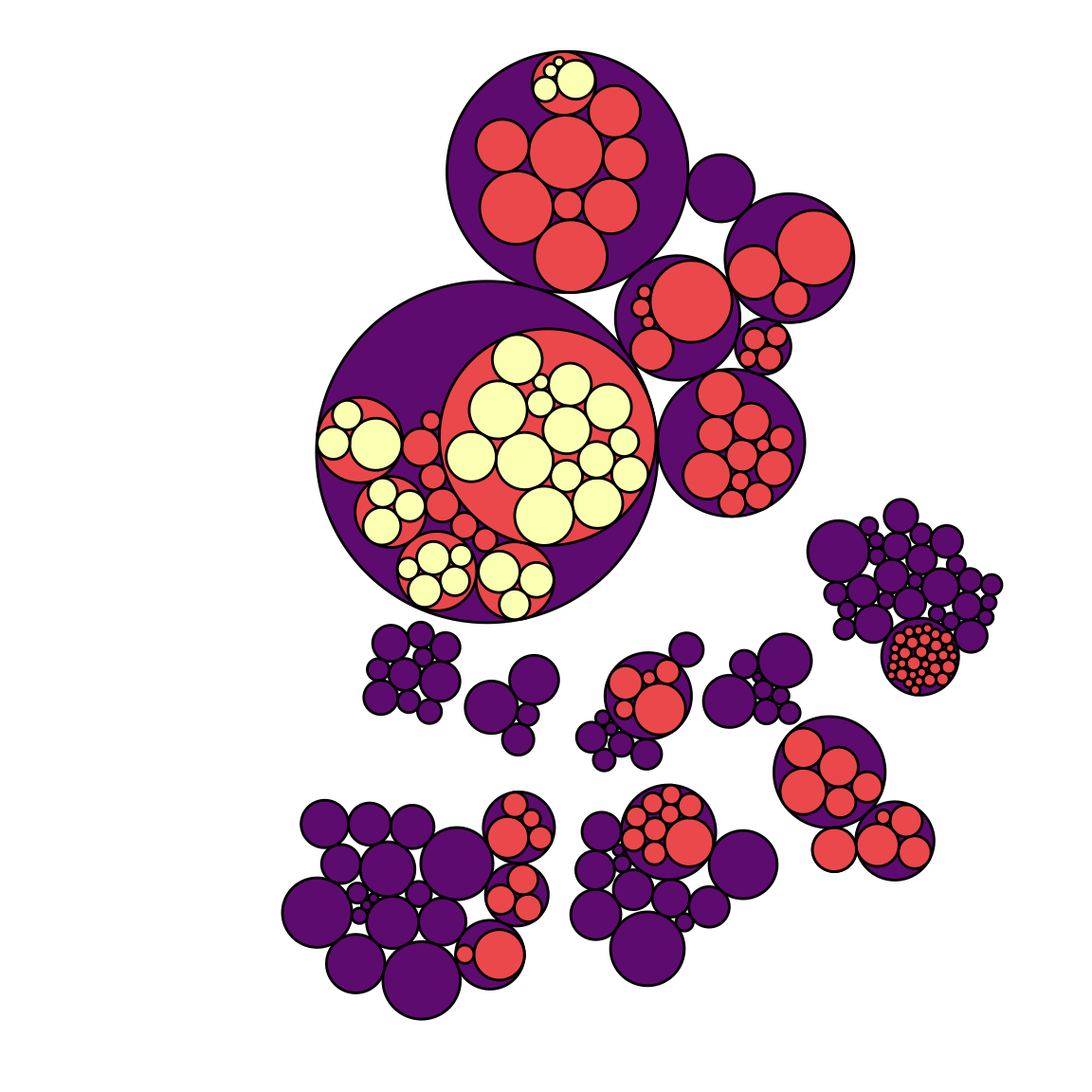
Note that if only one level of hierarchy is displayed (no encapsulation), it becomes equivalent to a barplot. Instead of showing the value of each individual as a bar, it uses a circle.
The R and Python graph galleries are 2 websites providing hundreds of chart example, always providing the reproducible code. Click the button below to see how to build the chart you need with your favorite programing language.
Any thoughts on this? Found any mistake? Disagree? Please drop me a word on twitter or in the comment section below:
A work by Yan Holtz for data-to-viz.com


